
>Design-speak
“It’s ... a jump to the left”
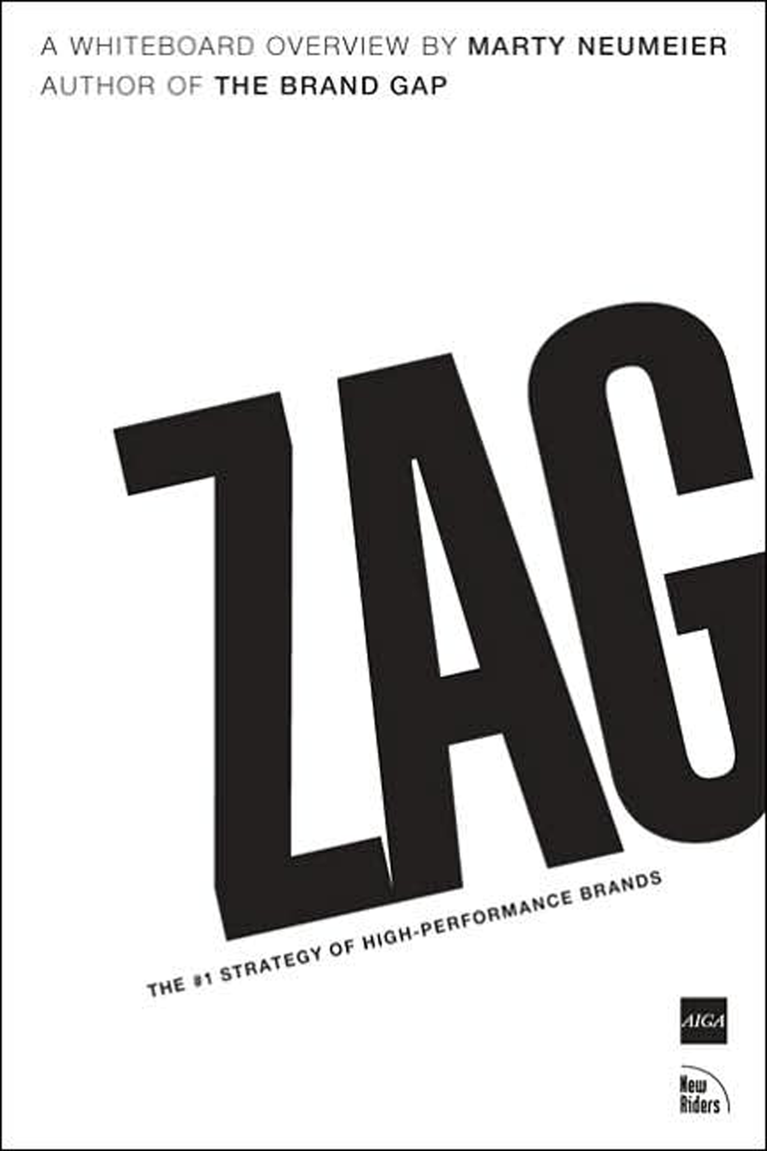
The book “ZAG” —and its message of radical (brand) differentiation—inspired the design of Stahl’s “S” symbol. The graphic red arrow, which skillfully veers left, reminds us to choose the unbeaten path and zag when everybody else zigs.

Brand expressions are more effective when they resonate from a clear direction of intent and purpose.
Design-speak—part of the story
In message, Stahl’s symbol is both precise and irreverent at the same time. Sharp edges and smooth thin lines contrast the contorting directional arrow which boldly ignores the letterform. The caution-yellow accent signals the peril of zigging right.
Somewhat impressionistic in effect, the graphic embodies the squishy, intangible nature of creating image. The utility of letterform symbolism is rarely questioned when it references the subject in a provocative fashion.
What’s a logo worth?
Your logo is at the front gate of managing perceptions. Logos offer instant recognition and forever symbolize your brand. An experienced designer, who understands your vision, and your strategic intent, can save you immeasurable time and money in the long run. Your identity is not the place to scrimp.
After first impressions, perceptions change to beliefs
Consider that your brand can actually hold your business back. Without you knowing, your service or your offer can evoke an array of unintended perceptions. From poor quality and unprofessionalism, to questionable values and even total irrelevance—as judged by your customer. And it may or may not be your reality. It can happen at the onset or it can gradually erode over time.
Perceptions occur somewhere in that fuzzy space between the image you establish and the messages you send. Very quickly though, perceptions take hold as beliefs, at which point, you’ve been defined—you just hope it’s a definition you can live with. Some of these problems may be difficult for you to see, others difficult to fix.
Manage first impressions, it is far more beneficial and significantly less expensive compared to trying to change a belief later.
Contact Stahl to help with the fuzzy stuff and get you all your brand’s worth.

BBH ad for Levi's, ca 1982
More about zag
The concept of zag was popularized in a Levi’s ad devised by John Hegarty, co-founder and creative director of London ad firm BBH. They were to create a poster announcing Levi’s new black denim jeans. Though the contrarian concept required some selling, success of the ad eventually sealed the deal between Levi’s and BBH. In fact, the chairman, Robert Haas, great-great-grandnephew of the company’s founder, Levi Strauss, framed it for his office saying, “this is what this company should be about.” He also sent Hegarty a black sheep for his office. BBH has used the image of a black sheep as their logo ever since. Hegerty says, “Sometimes, culture emerges from some thing you do.”
Thanks Marty Neumeier, we still love the book after more than 10 years in print.